Open Journal of Social Sciences
Vol.07 No.07(2019), Article ID:93971,21 pages
10.4236/jss.2019.77026
Ten Spatial Problems with myGeoffice© for Teaching Purposes
Joao Negreiros, Ansoumane Diakite
University of Saint Joseph, Macao, China

Copyright © 2019 by author(s) and Scientific Research Publishing Inc.
This work is licensed under the Creative Commons Attribution International License (CC BY 4.0).
http://creativecommons.org/licenses/by/4.0/


Received: March 18, 2019; Accepted: July 26, 2019; Published: July 29, 2019
ABSTRACT
For a long time, Geography did not hold a specific mathematical approach for any interpretation of space and this was the key reason why Geography degrees covered a wide variety of subjects such as demography, geology or topography to fulfill its curriculum. Yet from the 90’s, Geography finally created its own research agenda to meet four vital questions of any true geographer: “Where is …?”, “Is there a general spatial pattern?”, “What are the anomalies?” and “Why do these phenomena pursue certain spatial distribution?” The present review article addresses ten different spatial (point, regression and event) issues for learning and teaching aim where statistics play a major background role on the outcomes of myGeoffice© free Web GIS platform. These include cluster analysis, geographically weighted regression (GWR), ordinary least squares (OLS) regression, path analysis, minimum spanning tree, linear regression, space-time clustering and point patterns, for instance. Although the technical viewpoint of the algorithms is not explained at fully, this review paper makes a rather strong emphasis on the result’s interpretation, their respective meaning and when these techniques should be applied in a learning/teaching context.
Keywords:
Geography, Geographic Information Systems, Spatial Analysis, myGeoffice©, Learning and Teaching

1. Introduction
1.1. Statement of the Problem
If Geography did not exist, it had to be invented. In fact and according to [1] , it had been estimated that 80% of the informational needs of local government policymakers are related to geographic location. As a result, all F1-F6 levels of Secondary Schools hold this subject all over the world. Currently, any typical Geography subject encompasses a wide variety of issues such as types of rocks and territories, flora and fauna biodiversity, map scales and compasses, countries and flags, latitude/longitude and cartographic projections, time zones and economical spaces, water cycle and watersheds, temperature and other weather factors (El Nino, oceans and the dynamics of streams), tectonic plates and volcanoes, growth and composition of world’s population, cultural diversity and urbanization, migration and poverty, forests and deserts, agriculture and fisheries, tourism industries, environmental risks and protected natural regions, commercial routes and hurricanes, rotation/translation of our planet Earth, the Milky Way ….
Without any doubt, all these topics are essential for the description of space, as we know it. Yet, under the current Internet age, Geographical Information Systems (GIS) is seldom included in any Geography syllabus to foster inferential analysis of spatial data. Undoubtedly, the state of contemporary education in this field leaves much to be desired [2] where, quite probably, paper maps will be completely obsolete in 10 years.
With the development of new digital technologies, the field of Geography is undergoing a major significant digital transformation [3] . In fact, nowadays, many GIS applications can be found in the real world such as tourism, aviation, archaeology, agriculture, water and air pollution, crowed simulation, parking availability, overfishing, telecom and network services, accident analysis, urban and transportation planning, environmental issues, navigation and flooding damage estimation, banking and general business sector, geology and coal mines, volcanic hazard identification, desertification and deforestation, public health applications, crime analysis, locating underground pipes and cables. Mobile technology is not an exception too, where Collector for ESRI ArcGIS allows researchers to gather multi-sensory field data [4] . Quoting [5] , if GIS connects what with the where, geographic information science discovers how.
1.2. Structure of the Article
The aim of this review paper is to raise awareness about the importance and use of Web GIS. In other words, the purpose is to stimulate interest in young students, teachers and other fans of Geography for myGeoffice©, a free Web 2.0 tool. Besides this introduction, conclusion and references, the core of this writing is subdivided into three main sections:
➢ Point analysis (cluster analysis of the ovarian cancer in Portugal, Dijkstra optimal route and Kruskal minimum spanning tree problem among eight cities of Brazil).
➢ Spatial regression (GWR and OLS multiple regression of the lung cancer dataset in Ohio, USA).
➢ Event analysis (binomial probabilities of powerful earthquakes in Japan, Poisson likelihood of strong typhoons in the Philippines, Knox index with the motorbike’s crashes dataset in Hangzhou, China, moving spatial statistic of burglaries events in Toronto, Canada, and point pattern correlation between Madrid and Seville, Spain, regarding response time of ambulances).
The ten issues presented here follow this framework. Based on different spatial real data from Portugal, Brazil, USA (Ohio), Japan, Philippines, China (Hangzhou), Canada (Toronto) and Spain (Madrid and Seville), myGeoffice© techniques were applied on a kind of democratization of mapping and analysis of the world around us. After all, if Geography is key to understand spatial daily changes, the Internet became the platform. Yet, it is GIS analysis allows us to evaluate suitability and capability, estimating and predicting, interpreting and understanding those changes [6] .
Again, it is expected that readers may comprehend and take the below ten spatial problems into their classroom for discussion and construct new knowledge in a spatial way of thinking. The reader must understand that Web GIS, in general, and myGeoffice©, in particular, is more than just mapping software that is running online. It is actually a partial statistical software for discovering, consuming and sharing geographic data to fulfill particular objectives. In the end, the goal of this review article are to open the reader’s eyes to what is now possible with Web GIS and, since the internal algorithm’s geocomputation was forgotten here, the basics of Web GIS are easy, engaging and, above all, now accessible to everyone, not just for the experts. Quoting [6] , if we think of Geography as the ultimate organizing principle for the planet, then Web GIS is the operating system.
2. Point Analysis Techniques
2.1. Is There Any Pattern among Hospital Costs Regarding Ovarian Female Cancer Expenses in the Twelve Districts State Hospitals of Portugal?
Cluster analysis classifies a set of observations into two or more mutually exclusive unknown groups with the aim of data reduction, that is, to organize a system of data observations into groups where members of those groups share common properties [7] .
Globally, this technique tries to find groups with a high intra-class similarity and a low inter-class one. For instance, the practitioner may be able to form clusters of customers who have similar buying habits in specific supermarkets for marketing geo-segmentation purposes. Identify groups of houses according to their type, value and geographic location based on their credit history is another example [8] . Yet and under the GIS perspective, this cluster procedure is considered aspatial since the geographical component is not used by this algorithm [9] .
Portugal is a country located mostly on the Iberian Peninsula in southwestern Europe. It is the westernmost country of mainland Europe, bordered to the west and south by the Atlantic Ocean and to the north and east by Spain. Its continental territory with ten main districts (Minho, Montes, Douro, Beira Alta, Baixa & Litoral, Extremadura, Ribatejo, Alto and Baixo Alentejo, Algarve) also includes the Atlantic archipelagos of Azores and Madeira.
Figure 1 address the ovarian cancer average cost of different government hospitals in the cited twelve districts for the year 2016. Independently of the context, cluster analysis will always produce a group that may or may not prove useful for classifying districts, regions, wards or counties, for instance. It starts with each area describing a subgroup and then combines subgroups into more inclusive subgroups until only one group remains.
The similarity threshold between groups is another parameter that may lead to a different cluster classification of these twelve district state hospitals. For example, it is possible to consider that cluster one is composed of hospital 11 (Madeira), 12 (Azores) and 5 (Beira Baixa) while cluster 2 regards the remaining nine hospitals. Yet, it is also possible to consider three clusters instead: 1 (Minho), 6 (Beira Litoral), 8 (Ribatejo), 3 (Douro) & 9 (Alto Alentejo) VS 7 (Extremadura), 10 (Baixo Alentejo), 2 (Montes) & 4 (Beira Alta) VS 11 (Madeira), 12 (Azores) & 5 (Beira Baixa). Again, it is up to the investigator to explain these arrangements, that is, cluster analysis does not enlighten the reasons why these costs hospitals behave in this particular way. Basically, this technique only supplies clues or evidences for the scientist to investigate about possible explanations or causes for those twelve hospitals cost’s performance. Logically, if those clusters discriminate certain patterns then cluster analysis can be useful. However, that may not be the case in all situations.


Figure 1. As well, different methods of clustering (myGeoffice©, for instance, does not cover K-Means) may generate different outcomes for the same dataset.
2.2. What Is the Optimal Route Path between Ribeirao Preto and Other Seven Brazilian Cities?
Dijkstra path analysis, an algorithm conceived by the Dutch scientist Edger Dijkstra in 1959, is a graph search procedure that solves the single-source shortest path problem for a graph with non-negative path costs. If the vertices of the graph represent cities and the link costs represent, for example, driving distances between pairs of cities connected by a direct road, Dijkstra’s algorithm can be used to find the shortest route between one city and the remaining ones [9] . As a result, this shortest path first is widely used in network routing protocols, most notably IS-IS (Intermediate System to Intermediate System) and OSPF (Open Shortest Path First).
Let’s consider seven Brazilian cities that are supplied with coffee every week by a logistic transportation company from Ribeirao Preto (Sao Paulo state). The seven branches are spread around the country as depicted in Figure 2 and the purpose is to find the shortest routes between the headquarters of Ribeirao Preto and the seven branches (Manaus, Belem, Recife, Salvador, Goiania, Rio de Janeiro, Porto Alegre), according to the minimal road distance among them (because of time and fuel expenses concerns).


Figure 2. Based on the Km distances among these eight cities, Google Map layouts myGeoffice© results for an easier understanding of the final outcome.
2.3. How Can I Connect the Previous Eight Brazilian Towns (With Computer Private Cables, for Instance) Based on a Minimal Cost Strategy?
Kruskal is a graph algorithm that finds the minimum spanning tree for a connected weighted graph. Specifically, it finds a subset of edges (cities) within a connected tree (roads between towns) where the total connection weights (liters of gas, time or space distances, for example) among all edges of the present tree are minimized. If the graph is not all connected, as expected, it finds a minimum spanning tree for each connected component [9] .
Kruskal has been in use in many real problems. [10] , for instance, report that alteration of power network topology is often required to meet important objectives, such as restoring connectivity, minimizing power losses, maintaining stability and maximizing power transfer capability. This may be achieved by switching circuit breakers devices in the power network, including the electrical distribution reconfiguration of the network. For that, these academics used Kruskal’s maximal spanning tree algorithm to search for the optimal network topology and to optimally convert an interconnected meshed network into a radial system to achieve best operational characteristics, cost and control [10] . By considering the same settings of the previous sub-section, the present objective becomes to connect the seven branches and the headquarters with a private computer data cable for internal private data use of this fictitious firm (see Figure 3).
3. Spatial Regression Techniques
3.1. What Can GIS Tell Me about the Spatial Distribution of Lung Man Cancers in Ohio, USA?
Geographical Weighted Regression (GWR) is one of several spatial regression techniques that provides a local model of the variable the researcher are trying to understand/predict (dependent variable) by fitting a regression equation (based on one or several independent variables) to every feature in the spatial dataset [11] . However, the novelty of this GIS approach regards the estimation for each location (see Figure 4) by only depending on their closer space neighbors and defined by the Kernel bandwidth (respecting First Law of Tobler, that is, everything is related to everything else but near things are more related than distant things).
[12] , for instance, use GWR to examine the spatial effect of urbanization, energy intensity, energy structure and income on HCE (household CO2 emissions). Their results indicate an obvious spatial effect on carbon emissions in the studied provinces whose urbanization impact presented an increasing trend from the south-eastern coast to the north-west from 2000 to 2015. As well, energy intensity had a remarkably positive effect on HCE for the same time period, although it had a negative effect in all provinces in 2005 and in some provinces in 2010. Likewise, income was a powerful explanatory factor for growth in household CO2 carbon emissions in all years. At last, the effect of income on HCE was positive and showed an increasing tendency year by year.


Figure 3. Again, Google Map can translate myGeoffice© results for visualization purposes. For reference and provided by myGeoffice©, Prim is another graph algorithm that addresses the same minimum spanning tree challenge.

Figure 4. GWR uses local model estimation for each regression point based on the bandwidth (all points outside of the bandwidth range receive a zero weight for the local estimation) and on the chosen decay kernel function (image source: rose.bris.ac.uk).
Ohio state is composed of 88 counties whose lung man cancers has shown atypical values when compared with the remaining 49 states of the USA (unsurprisingly, a particular sensitive issue for health insurances and local hospitals). Is it possible to infer any particular spatial trend, pattern and outlier from the present Ohio situation? For illustration purposes, the present spatial dataset holds 88 records and five variables: Latitude and longitude of each county, number of man lung cases in 1988 for each county (dependent variable), white and black population at risk (independent variables).
Within GWR, each Beta parameter of each local estimation (yi = β0 + β1x1i + β2x2i + εi) has a sign and a magnitude according to each location (the essence of spatial heterogeneity, that is, the structure of the model changes from place to place across the study area as the parameter estimates change towards each other inside the model). If the sign is positive, an increase of the variable value to which the parameter refers will induce an increase in the dependent variable. If the sign is negative, a decrease will be induced. As stated by [13] , parameter estimates for a variable that are close to zero often tend to be spatially clustered indicating that in these sub-regions of the study area, changes in this variable do not influence changes to the dependent variable. As well, large Betas imply a major influence of the independent variable over the dependent one. Consequently, this is potentially interesting and encourages further curiosity about the process, the data, the model and the outcome. At last, if a high value of the intercept Beta0 is found, this can be interpreted as the lacking of significant other variables in the final model such as number of real smokers, age, smoking habits (cigarette types, number of years and daily frequency of smoking), health status or air pollution.
From Figure 5 and as expected, it can be inferred that each GWR parameter has a sign (positive or negative) and a value according to each location. For instance, county one (Adams) with 13 lung cancer cases (dependent variable) and 12,443 and 6316 population at risk (white and black man, respectively) had a GWR estimation of 11.94 man lung cancers. The local spatial regression can, thus, be written as LungCancersAdams = 3.826991 + 0.000636 × WhiteRisk + 0.001631 × BlackRisk (it seems that in this particular county, BlackRisk contributes to the dependent variable more than the double when compared with WhiteRisk factor).
One of the basic statistics assumptions of regressions concerns the location of residuals (positive and negative) that should layout in a random way. For the present spatial dataset, these residuals are displayed on the left bottom image of Figure 6. Still, some clustering of over and/or under predictions become evident which means that the investigator is missing, at least, one key explanatory variable of the initial model.
By examining the coefficient raster surface produced by GWR (to better understand the regional variation of the independent variables), it is, hence, possible to examine the spatial consistency (stationarity) relationship between the dependent (LungCancers) and both explanatory variables (WhiteRisk and BlackRisk, respectively) across Ohio state (see Figure 7).
3.2. May I Generate a Prediction Linear Model for the Lung Man Cancers in Ohio, USA, with myGeoffice©?
The conventional Ordinary Least Squares (OLS) multiple regression focus on the relationship between a dependent variable (Y = LungMaleCancers) and one or more independent ones (X1 = WhiteRisk and X2 = BlackRisk, in this particular case) such as Y = Beta0 + Beta1 × X1 + Beta2 × X2 (according to Figure 7 results, the prediction model becomes Y = 2.340396 + 0.000694 × X1 + 0.001549 × X2). Under the OLS framework and according to [14] , both Betas are solved by a set of normal equations that minimize the Residual Sum of Squares (RSS = TSS-ESS, where TSS denotes Total Sum of Squares and ESS symbolizes Explained Sum of Squares).


Figure 5. The high standard deviation (90.4) and skewness (4.36) of the male lung cancer dependent variable warns us about the difficulty to apply the conventional OLS regression. For reference, when comparing with other regression models, the lowest corrected AIC, the better the model is.


Figure 6. The upper right map presents the dependent variable spatial distribution, according to each magnitude. From the below right bottom map, an interesting high GWR prediction of lung cancers in the North-East and South-West counties of Ohio can be found. On the other hand, North-West counties are characterized by small estimations.

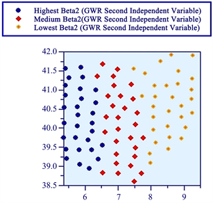
Figure 7. It is clear a strong variation in the North/East counties due to WhiteRisk (Beta1) factor while South/West region is more influenced by BlackRisk (Beta2).
Once a regression model has been constructed, it is vital to confirm the model goodness via the R-squared index (R2 = 98.7982%) while the global model significance can be checked by the F-test (3493.791557, in this particular case) that follows a χ2 distribution. Since the degrees of freedom (df) equals (2.85), the threshold acceptance value of the null hypothesis (H0) is approximately 5.18 leading, consequently, to the inference of H0 rejection. As expected and confirming the strong linear relationship of the right graphs of Figure 8, this model is nearly a perfect linear one. At last, no regression errors correlation between successive observations were found and confirmed by the Durbin-Watson statistic (1.610162). For reference, the Durbin-Watson statistic always produce a value between 0 and 4 where a close value to 2 means that the dataset holds no error autocorrelation. On the other hand, a value below 1 signifies that there is statistical evidence that the error terms are positively correlated and a Durbin-Watson greater than 3 implies a negative correlation presence.

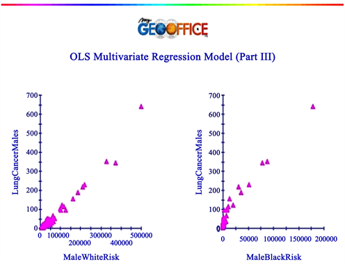
Figure 8. As a curiosity (and expected), the Spearman Man Rank correlation (a value that varies between –1 and +1) between WhiteRisk and BlackRisk factors equals 0.8615.
4. Even Analysis Techniques
4.1. What Is the Chance of a Level 6 or Higher Earthquake to Happen in One of the Nine Most Prone Japanese Cities in the Next 3 Decades?
The binomial distribution is used for discrete random variables and it is appropriate when an event has only two possible outcomes: success (p probability of first outcome) or failure (q = 1 − p, that is, likelihood of second outcome). Recalling that the odds of all outcomes should sum to one, it is, thus, mandatory that p + q = 1 (p represents the possibility of a car being robbed in a particular city, for instance, while q equals the complementary likelihood of not being stolen).
As stated by [15] , a random variable is considered binomial if the following four conditions are met: 1) There are a fixed number of trials (n); 2) Each trial has two possible outcomes: success (p) or failure (q); 3) The probability of success (p) is the same for each trial; 4) The trials are independent, meaning the outcome of one trial does not influence the outcome of any other trial. The present question respects all these requirements.
The Richter magnitude scale is the most common standard of measurement for an earthquake. It was invented in 1935 by Charles Richter of the California Institute of Technology as a mathematical device to compare the size of earthquakes. Essentially, the 10 levels of the Richter scale quantify the amount of energy released during an earthquake, where each level is ten times stronger than the previous level [16] .
Japan is the country with more earthquakes worldwide, where more than 2000 quakes are felt by Japanese every year. According to [17] , Mito, Shinjuku, Chiba, Yokohama, Nagoya, Shizuoka, Obihiro, Kushito and Nemuro are highly prone cities to get a level 6 quake in the next 30 years. Chiba, for example, holds an 85% probability of having a level 6 or higher quake, Kushiro has a 69% while Nagoya presents a 46% of likelihood for this kind of natural disaster. Since Obihiro presents the minimum probability (22%) of being devastated by a level 6 or higher quake for the next 3 decades, this likelihood was the one adopted for this problem (see Figure 9).
4.2. What Is the Probability of Having between 5 and 7 Typhoons Every Year in the Philippines?
The Poisson distribution is applicable for count variables and it played a key function in experiments that had a historic role in the development of molecular biology [18] . For this author, the interpretation and design of experiments elucidating the actions of bacteriophages and their host bacteria during the infection process were based on the parameters of the following Poisson equation: (P(x − μ) = (e − μ)(μx)/x!, where x is the actual number of successes that result from the experiment and e equals (approximately) to 2.71828.
This discrete probability expresses the chances of a given number of events occurring in a fixed interval of time and/or space (these events occur with a known average rate and are independent of the time since the last event). It is different from the Binomial distribution since it relies on an average estimate which may be derived from the long term average of occurrences such as the number of landslides along a mountain slope over a period of 50 years [7] . Hence, the Poisson distribution allows us to determine the probability of having a given number of occurrences.
These appealing features of this particular event distribution may be used for spatial issues. For instance, in average, the Philippines are hit by eight tropical cyclones (typhoons) yearly. If so and according to the Poisson calculations (see Figure 10), the probability of having four typhoons next year is 5.72% while the likelihood of having no typhoon is 0.03354%. Therefore and statistically, the possibility of having between five and seven typhoons per year, for example, equals (0.0916 + 0.1221 + 0.1395) = 35.32%.

Figure 9. This computation can warn us, for instance, that the likelihood of three of those 9 Japanese cities of having a quake of level 6 or higher for the next 30 years is close to 20.14%.

Figure 10. As expected, the sum of these first one hundred probabilities supplied by myGeoffice© is equal or quite close to one.
4.3. Is There Any Space-Time Clustering of Motorbikes Crashes in Hangzhou, China, on March 19, 2018?
Globally, the Knox Index is a comparison of the relationship between incidents in terms of space and time, where each individual pair is compared in terms of the Euclidean distance and in terms of the time interval. Since each pair of points is being compared, there are N × (N − 1)/2 pairs, where N equals the total number of events (12 in this particular case study). Internally, the distance between events is divided into two groups—“Close in distance” and “Not close in distance” whereas the time interval between events is likewise divided into two similar groups—“Close in time” and “Not close in time” [19] .
Hangzhou is the capital of Zhejiang Province, China, and the local political, economic and cultural center. This metropolis is located on the lower reaches of the Qiantang River in southeast China, a superior position in the Yangtze Delta and only 180 km from Shanghai. On March 19, 2018, twelve motorbikes crashes with other motorized vehicles in this beautiful city. Can we statistically hypothesize about space and time clustering of these events on that particular day?
Since the Knox Index is a one-tailed test that follows a Chi-square distribution (a high value is an indicative of spatial interaction) and based on the results of Figure 11, it is possible to statistically affirm that there is a spatial-time clustering of these crashes events for this date in Hangzhou and, thus, the null hypothesis of a random distribution of these crashes between space and time should be rejected.
4.4. Where Will Be the Next Flat Burglary?
The spatial-temporal moving average statistic comprehends the moving mean center of M observations across time, where M is a sub-set of the total sample events, N. Basically, this moving spatial concept implies that all N observations are sequenced in order of occurrence and, hence, it is implicit that there is a time dimension associated with the sequence itself [19] . The M observations are called the span and, under myGeoffice©, the default span is 5 observations. The span is centered on each observation so that there are an equal number on both sides. Because there are no data points prior to the first event and after the last event, the first few mean centers will have fewer observations than the rest of the sequence.
Quite often, spatial patterning of incidents doesn’t occur uniformly throughout the year, but instead are often clustered together during short time periods [19] . At certain occasions, a rash of incidents will occur in certain neighborhoods and the police often have to respond quickly to those events. In other words, there is both clustering in time as well clustering in space. For instance, [20] reports that the New York City Department of Health and Mental Hygiene has operated an emergency department syndromic surveillance system since 2001, using temporal and spatial scan statistics run on a daily basis for cluster detection. Though simple, this technique is very useful for detecting changes in behavior by serial offenders [19] .


Figure 11. Yet again and analogous to section 2.1, it is up to the scientist to investigate of the possible causes of this space-time pattern. For curiosity, the Mantel Index, a Pearson product-moment correlation between distance and time interval for events pairs, equals 0.1872.
Toronto is the capital city of the province of Ontario and the largest city in Canada by population, with 2,731,571 residents in 2016. As a global city, Toronto is a center of business, finance, arts and culture and is recognized as one of the most multicultural and cosmopolitan cities in the world. However and like any other city, housebreakers are common. Statistically, is it possible to predict a possible location for the next flat robbery? Can GIS help local police authorities on this spatial matter? (see Figure 12).
4.5. Is There Any Correlation between the Average Response Time of an Ambulance between Madrid and Seville, Spain?
Point pattern (geographical phenomena that may be reasonably modelled as


Figure 12. Based on a hypothetical space-time dataset of robberies in Toronto (the numbers attached to each location denotes the time sequence of each event), it seems that the following apartment robbery will be close to event six (Danforth music hall area).
point data such as clustering vs dispersion issues) also includes the relationship strength of a certain event within two study areas over a time period. In this particular case, the exact spatial locations of each event are not important. It only matters the number of events for each region according to each occurrence time. Using an illustration of [13] , imagine you want to check the correlation between the burglaries counting for two areas over a period of twelve months. When no second-order interaction occur, if the product of the first-order global means intensities for regions 1 and 2 (M1) is less than M2 (the ratio between the product average of the events number of region 1 and 2 by the product between both area regions) then this procedure suggests the burglary counts for those two regions are positively correlated. Furthermore, if those regions are spatially adjacent, this advocates that there is some degree of spatial clustering in the household burglaries. Again, when M1 and M2 expressions are approximately equal, no correlation is insinuated. Otherwise, negative correlation is implied (M1 > M2). Mathematically, M1 (Product) and M2 equal the following mathematical expressions:
· M1(region1) = AVG(count_region1)/Area1
· M1(region2) = AVG(count_region2)/Area2
· M1(Product) = M1(region1) × M1(region2)
· M2 = AVG(countRegion1 × countRegion2)/(Area1 × Area2)
Historically, ambulance care quality has been measured by response times to ensure that the highest quality and most appropriate response are provided for each patient on time [21] . Quite often, ambulance services are measured on the time it takes from receiving an emergency call to the time the patient arrives in the Emergency Department. For instance, in July 2017 and under the network of hospitals in England, Category 1 ambulance calls are those that are classified as life-threatening and needing immediate intervention and/or resuscitation. Their national standard sets out that all ambulance trusts must respond to Category 2 calls (the next emergency level) in 18 minutes on average and respond to 90% of Category 1 calls in 40 minutes [22] .
Unquestionably, to setup this kind of national standard is welcome for the continuous improvement on a better first aid help to all citizens. Yet, the geographical diversity among villages, towns and metropolis will also lead to different time responses that must be analyzed more careful rather than the simple average of the country. Moreover, certain cities are better well planned (quite often, for historical reasons) in terms of roads, bridges, tunnels and highways than others, leading to an unfair absolute comparison. Nevertheless, it is possible to assess the relationship of the ambulance response time among cities. If the performance correlation between two municipalities is negative, this simply means that the ambulance effort in one of the municipality is being deteriorated relatively when compared with the second one. As expected, some kind of a new syllabus must be accomplished to reverse this outcome in the future. Otherwise, if a positive association between both cities is found, the relative effort of both health ambulance professionals are linked to each other and no particularly need to change their present procedures (besides to continuously decrease those response emergencies times, if possible).
Covering an area of 604 Km2, Madrid is the capital of Spain and the largest municipality of this country with almost 6.5 million inhabitants. It is the third-largest city in the European Union, smaller than only London and Berlin. Seville, with an area of 140 Km2, is the capital and largest city of the autonomous community of Andalusia and it holds about 1.5 million people, making it the fourth-largest city in Spain. Is there any relation between the performance of ambulance response time of Madrid and Seville? (see Figure 13).
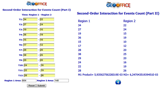
Figure 13. Based on the below dataset concerning ambulance response time in 2014, it can be deduced that there is a positive correlation between both Spanish cities, in spite of the average response ambulance time is higher in Madrid than in Seville.
5. Conclusions
Several classical statements concerning the definition of GIS can be found in specialized literature expressing the idea that spatial analysis can somehow be useful. GIS can be seen as a spatial analysis engine and its main end relies on the ability to predict outcomes and, above all, to understand those [23] . GIS is simultaneously the telescope, the microscope, the computer and the Xerox machine of regional analysis and the synthesis of spatial data [24] . GIS is a specific class of information systems designed to capture, storage, manipulate, retrieve, analyse and display all forms of geographically referenced data and information [25] . Certainly, GIS is not a mapping database.
By using myGeoffice©, ten different spatial matters are addressed in this review paper and under the quantitative approach. This happens because viewing and analyzing data geographically impacts our understanding of the world we live in. Nonetheless, another classic quantitative approach concerns shoreline limits, for example, which are particularly useful for the study of global warming effects on coastal cities. Which shoreline should be adopted? Should the geographical database be dynamic and capable of tracking fluctuations? One possibility is to consider the shore slope classification and the time sea level above the height of the lowest tide. Since tides follow a deterministic formula, it is possible to calculate the exact shoreline location for a given time t [26] .
Somehow, it is implicit that spatial analysis is a GIS component to support decision-making (one of the five GIS Ms: mapping, measurement, monitoring, modelling and management) for solving problems with a spatial component. This happens because geographic problems require true spatial thinking [27] .
Conflicts of Interest
The authors declare no conflicts of interest regarding the publication of this paper.
Cite this paper
Negreiros, J. and Diakite, A. (2019) Ten Spatial Problems with myGeoffice© for Teaching Purposes. Open Journal of Social Sciences, 7, 297-317. https://doi.org/10.4236/jss.2019.77026
References
- 1. Desgupta, A. (2015) Geospatial Vision for Sustainable Future. Geospatial World, 5, 7.
- 2. Key, H.U., Monteiro, E. and Negreiros, J. (2018) Implementation of Item Response Theory to English Grammar Assessment to Foster Learning. International Academic Conference on Global Education, Teaching and Learning, Budapest, August 2018, 30-36.
- 3. Norte, P., Negreiros, J. and Correia, A. (2017) Cultivating Students Reading Literacy Using Digital Lexile-Based Reading in a Chinese Primary School. CELDA—Cognition and Exploratory Learning in Digital Age, Vilamoura, 18-20 October 2017, 51-59.
- 4. Pánek, J. and Glass, M. (2018) Gaining a Mobile Sense of Place with Collector for ArcGIS. Journal of Geography in Higher Education, 42, 603-616.
- 5. Williams, R. (1987) Selling a Geographical Information System to Government Policy Makers. Annual Conference of the Urban and Regional Information Systems Association, Fort Lauderdale-Florida, 2-6 of August 1987.
- 6. ESRI Press (2017) The ArcGIS Book—10 Big Ideas about Applying the Science of Where. Redlands, 170 p.
- 7. Negreiros, J. (2015) myGeoffice©: Overview of a Geographical Information System. Proceedings of 14th ISERD International Conference, Kuala Lumpur, October 2015, 12-16.
- 8. Folkard, A. (2004) Mathophobic Students’ Perspectives on Quantitative Material in the Undergraduate Geography Curriculum. Journal of Geography in Higher Education, 28, 209-228.
- 9. Negreiros, J. (2017) Spatial Analysis Techniques Using myGeoffice©. IGI Global, Hershey, 336 p.
- 10. Sarkar, D., De, A., Chanda, K. and Goswami, S. (2015) Kruskal’s Maximal Spanning Tree Algorithm for Optimizing Distribution Network Topology to Improve Voltage Stability. Electric Power Components and Systems, 43, 1921-1930.
- 11. Wheeler, D. and Páez, A. (2010) Geographically Weighted Regression. In: Fischer M. and Getis, A., Eds., Handbook of Applied Spatial Analysis, Springer, Berlin, Heidelberg, 461-486.
- 12. Wang, Y., Zhao, M. and Chen, W. (2018) Spatial Effect of Factors Affecting Household CO2 Emissions at the Provincial Level in China: A Geographically Weighted Regression Model. Carbon Management, 9, 187-200.
- 13. Fotheringham, A., Brunson, C. and Charlton, M. (2009) Geographically Weighted Regression: The Analysis of Spatially Varying Relationships.
- 14. Bun, M. and Harrison, T. (2019) OLS and IV Estimation of Regression Models Including Endogenous Interaction Terms. Econometric Reviews, 38, 814-827. https://doi.org/10.1080/07474938.2018.1427486
- 15. Rumsey, D. (2016) Statistics for Dummies. John Wiley & Sons, Hoboken, 416 p.
- 16. Rafferty, J. (2018) Ritcher Scale. Britannica Encyclopaedia. http://britannica.com/science/richter-scale
- 17. National Research Institute for Earth Science and Disaster Resilience (2018). http://www.bosai.go.jp/e
- 18. Grammer, R. (2017) The Poisson Distribution in Biology Instruction. The American Biology Teacher, 79, 10-13. https://doi.org/10.1525/abt.2017.79.1.10
- 19. Levine, N. (2015) CrimeStat: A Spatial Statistics Program for the Analysis of Crime Incident Locations (v 4.02) Ned Levine & Associates, Houston, Texas, and the National Institute of Justice, Washington DC.
- 20. Mathes, R., Lall, R., Levin-Rector, A., Sell, J., Paladini, M., Konty, K. and Weiss, D. (2017) Evaluating and Implementing Temporal, Spatial and Spatio-Temporal Methods for Outbreak Detection in a Local Syndromic Surveillance System. PLoS ONE, 12, e0184419. https://doi.org/10.1371/journal.pone.0184419
- 21. Coster, J., Turner, J. and Sirwardena, N. (2013) Prioritizing Outcome Measures for Ambulance Service Care: A Three-Stage Consensus Study. Journal of Epidemiology and Community Health, 67, A33-A34.
- 22. Health Foundation (2018) Ambulance Response Time. http://qualitywatch.org.uk/indicator/ambulance-response-times
- 23. Bolstad, P. (2016) GIS Fundamentals: A First Text on Geographic Information Systems. Fifth Edition, XanEdu Publishing Inc., Ann Arbor, 770 p.
- 24. Abler, R. (1993) Everything in Its Place: GPS, GIS and Geography in the 1990s. The Professional Geographer, 45, 131-139.
- 25. Sá, D. and Costa, A. (2008) Participatory Geographic Information Systems. In: Putnik, G. and Cunha, M., Eds., Encyclopaedia of Networked and Virtual Organizations, Information Science Reference, Hershey, Vol. 2, 1179-1184.
- 26. Silva, J., Monteiro, P., Negreiros, J., Aguilar, F. and Aguilar, M. (2012) Modelação Espacial da Precipitação na Ilha de Santiago, Cabo Verde, com o GeoStatistical Analyst©. http://sugik.isegi.unl.pt/documentos/doc_92_1.pdf
- 27. Furtado, J. and Negreiros, A. (2010) Temperature Spatial Modulation of Santiago, Cape Verde, Island with GeoStatistical Analyst. CAPTAR: Environmental Science, 3, 46-54.